Getting Ideas
This afternoon we went to visit the Sunset Idea House, which is right next door to the Sunset offices in Menlo Park.
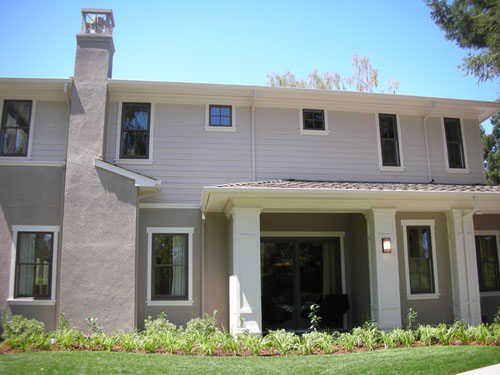
It's a big-looking house from the street, but not massive by suburban standards (though, of course, larger than our house by a few hundred square feet). The space is about evenly divided between private space and communal rooms, with three regular bedrooms and one massive master suite. I've never really seen the need for a master suite, myself, but then again, we don't have kids.
Anyway, the point of the Idea House is that you can go through and get good ideas for decorating or designing your own house, and this one had some good stuff and some really major mistakes. Let's start off with stuff I liked a lot.
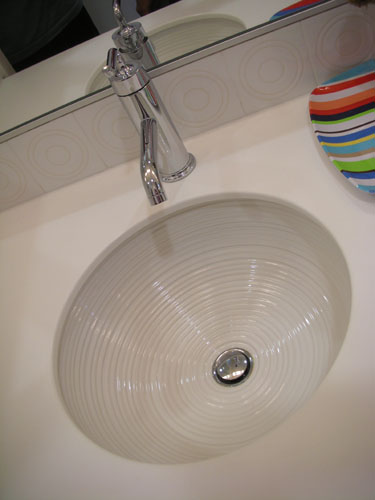
First of all, I love undermounted sinks. They are easy to clean, and when you spill stuff it's easy to sort of push it into the sink without messing with a lip. This sink was in the "children's bathroom," and I really like not just the installation position but also the roundness and the slight texture (which was not deep enough to get all gunked up with toothpaste the way textured sinks can).
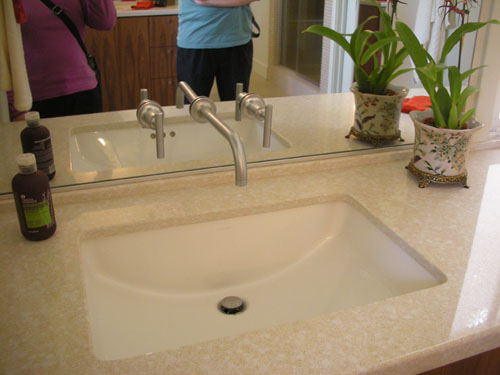
In the Master Suite, this sink was even nicer because it has wall-mounted faucets, which are even easier to keep clean. We're planning wall-mounted faucets in our future bathroom projects, and it's always good to see them in person. I don't think I would install the handles so they operated quite this way, but nothing was hooked up so it's hard to tell if they were in the on or off position.
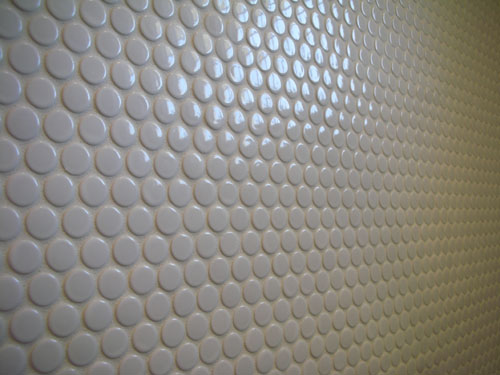
These neat round tiles (actually, I'm mostly into the grout job, which was outstanding) were in the kids' bathroom. I'm generally not a fan of wide grout lines because they look cheap to me, but in a case like this spacing makes the tiles work better graphically.
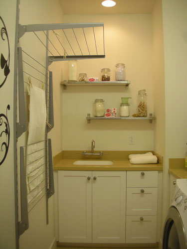
The laundry room has these neat laundry racks from IKEA. I know, given how much time we spend at IKEA, and how often I spend an entire afternoon flipping through the IKEA catalog, and the fact that 90 percent of our furniture comes from IKEA, you'd think I would have seen these before, but no.
Anyway, that was the stuff I liked a lot. And there was a lot of stuff that was sort of meh, not my style, but fine. I'm really not into the big suburban house thing, which should be pretty obvious by the fact that I live in a pit of disaster and doom and actually enjoy it. But there were some design mistakes that were big enough that I felt the need to warn you all.
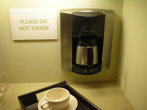
First: the built-in appliance. How long did your last coffee maker last? Are you prepared to patch that hole in the drywall when this one goes? Oh, and it's wired in, so when you do patch it, be prepared to flip the breaker and deal with the electrical connection, too. Getting a new coffee maker should not involve major house surgery.
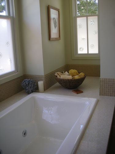
This one is something I see in tract homes a lot (sometimes we go out and tour developments on a weekend, for kicks). It's a random weird nook at the end of the tub. A great place to put... flowers? Something you're going to watch get really dusty because to clean it you have to climb into the tub? I don't get it, and I would hate having it. On the other side of the little interior wall is the sink; why not extend the sink countertop to the exterior wall and do away with the little interior wall altogether?
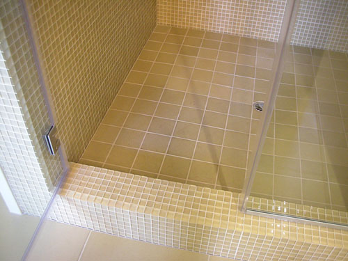
And finally: the shower curb. At some point in your life you are going to either get old or injure yourself such that getting over a curb to get in the shower takes work. Heck, just being nine months pregnant and trying to get into this shower is risking your life, and that's not outside of the demographic they're aiming for. When you are building the shower, just make it have a very very low curb, or none at all, because it doesn't really cost that much more and the value later on is so great.
This is the second Idea House we've been to see, and both of them have had bathrooms that could not be made accessible without ripping everything out (in the last one, without tearing down a wall, which is much worse). Smart design is not just fitting drawers into unique places, but thinking about how houses age with people, and what people will need from their houses.
On the way out, we stopped in and looked at the model home for the development that this house is a part of. The really strong contrast was in quality of finishes (model homes are always all-upgrades), but the thing you noticed the moment you walked in the door was the fumes. The Idea House was painted with low-VOC paint, and furnished with materials that were more natural and tended to offgas less, and that was definitely noticeable.
Technorati Tags: design, idea house, bathrooms
posted by ayse on 07/18/08