Choosing Paint Colours
This week I've been playing with some tools that can help you choose paint colours or colour schemes for your rooms. I thought I'd share some of them with you.
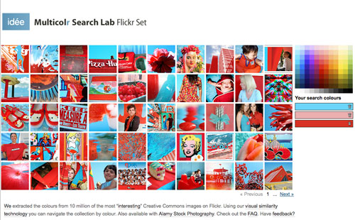
First, there's a colour-based photo search tool called the Multicolr Search Lab by Idee. Choose colours from the side palette, and it will show you pictures from Flickr with that combination (or single colour). Very handy for getting a sense of how a pairing will work in real life.
I chose three colours I'm playing with for our parlours: an aqua and bright red with pink. The palette of colours to choose from is pretty limited, but you can see that the range of photos you get contains shades beyond the ones you chose. That's why I like this tool better than colour scheme tools that show you monochrome swatches. You really do see how the colours interact.
In my case, I was looking for just the right shade of aqua to complement red furniture and a pink ceiling. I found lots of examples in Flickr with this tool.
Then I take those photos that I've found on Flickr and bring them into My Deco File, which is a new service by Domino Magazine. You don't need to make an account to browse through images, but you will want to, because it means you can save an image to your own file really easily. (OK, saving images on your hard drive is not that hard, but organizing them after a few weekends of messing around like that is hard. And try doing it after five years of just saving them into a folder "for later.")
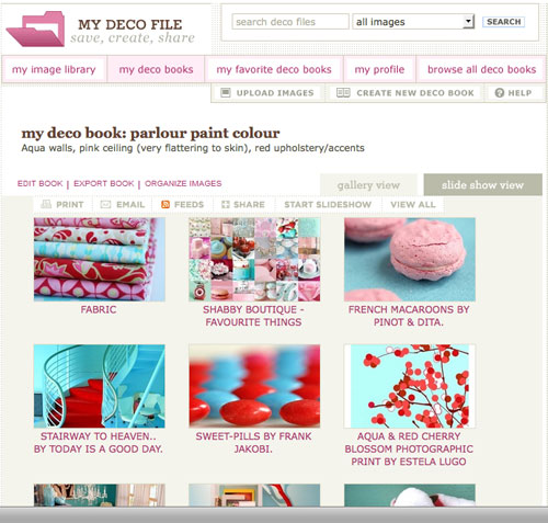
You can also add their handy image grab bookmarklet to your browser for saving images from web pages, so you can save that awesome dining room photo from Apartment Therapy to your Deco Book without going through a million steps. Very handy for compulsive image savers like myself.
Once you have those images, you can sort them into books, add notes and categories, and share the books. I find browsing other user's Deco Books really interesting. It's much cheaper than buying tons of decor books, and you can easily bring the images into your own books. You're not limited to sharing on Deco Book, though. You can share the books (like my book of colour swatches for our parlours, below) on your web site or on social networking sites like Facebook.
My only quibble is that they don't really take advantgae of the full capabilities of web development these days, so there's a lot of scrolling involved. Nonetheless, it is very useful, and if you're finding yourself sorting through tons of saved images online, I recommend it to help you manage them.
[edited to remove exploitative iframe app]
Once you have a good idea what colours you want, you can use the Benjamin Moore Personal Color Viewer (Flash-based) to try it out on a real room. I'm sure other paint companies offer this same service, but I happen to be a big Benjamin Moore fan, so I used theirs.
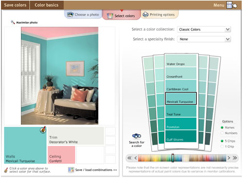
There are a couple of drawbacks to this particular service, even apart from the fact that it's a Flash application (which actually makes sense in this case). First, you have to know what product line the colour you want comes from. That'd be fine if you specifically wanted to limit yourself to one product line, but I'm choosing paint colours to match a sample image. I don't care whether this aqua colour is from the Preview collection or Classics.
The other drawback is that you can't change the furniture in the sample rooms at all, so you come up with a nifty set of paint colours and the furniture just looks awful.
My workaround for that is to save the image and attack it with Photoshop. It's rough and brutal, but it gives a better sense of the three colours in the room, and hides the hideous hotel art behind something more like what I'd really hang on a wall.
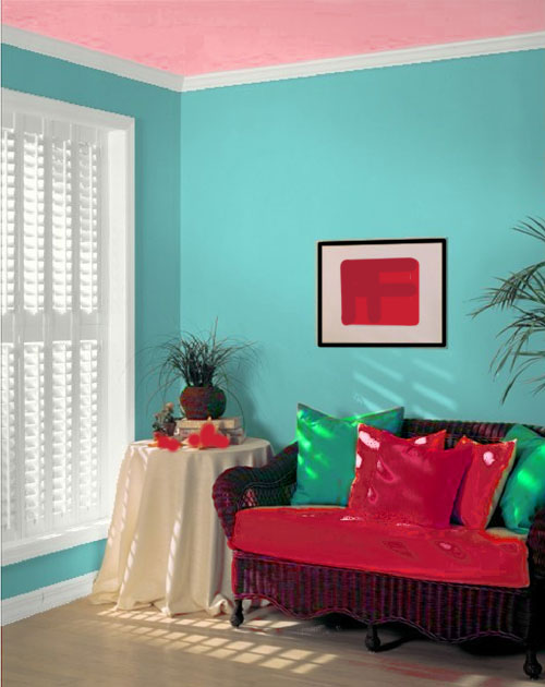
This lovely piece of work doesn't mean I don't spend some money on quarts of paint to test out the colours I've chosen (there is no way that a Flash application is getting colours anywhere near right, and colours always look different on a monitor because they are lit up, rather than having to rely on light in the room), but it does make narrowing down the colours to test out faster.
(Yes, I do want a turquoise living room with a pink ceiling.)
Technorati Tags: colour, design, design software, organization
posted by ayse on 01/17/09