Testing Colours
Last night, at the very last minute, I dashed off to Pagano's and picked up some samples of paint colours (and more primer, of course). Noel put on the second coat of primer, and after dinner we put up a couple of large patches of the two room colours I was considering.
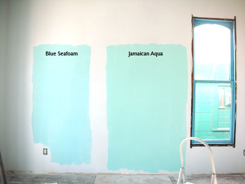
Before I say which one we've chosen, let me just say that I was kind of flustered by the fact that Pagano's was closing and it turns out that they only had a subset of the Benjamin Moore colours (I usually buy my paint at Mark's Paint, which has a larger selection). I accidentally had the man mix up the lighter shades of the two blues I was considering, which I didn't realize until we were reviewing the colours before I went to the checkout.
OK, I thought, I'm sure they'll seem too light, but at least I'll know whether they're too grey or not. But now, looking at them on the wall, I'm actually OK with the depth of colour in the two cans.
The difference between these two, for those who are looking at the wall and trying to determine what the choice is, is the amount of green in the colour. And I think after looking at the two side by side at night and in daylight, Jamaican Aqua, the swatch on the right, is what we'll be going with. I don't even think we need a deeper shade than this one, so my mistake turns out to be fortuitous.
We didn't test the can of pink paint I bought for the ceiling. That's a little trick I learned from an interior designer: the colour of the ceiling reflects down onto people's skin and changes the light in the room. With such a blue room, in bluish northern light, I thought some warm pink would balance the light nicely. Also, I wanted to freak the neighbors out.
Now to do some calculations and go buy lots of paint.
Technorati Tags: colour, design, painting, renovations
posted by ayse on 03/24/09